I’ve said before on this blog that in my world book covers are kinda a big thing. I’ve poked and prodded the attempts of others, championing them as good or ghastly. As a bit of fun I decided to have a crack at some designs, re-imagining book covers by warping them to resemble genres they are not. For example…this first one, making Harry Potter look like Dave Pelzer ‘Painful Lives’ book. After all, the poor wizard spends his first ten years or so living under some stairs, if that’s not a painful life, nothing is.

Ok, the Harry Potter one is a bit of a cheat. I could’ve used one of the original titles but they ate up too much space.
Next up is a book I consider a classic. John Wyndham ‘Day of the Triffids‘ is a brilliant book that has yet to be made into a decent film. The plot concerns mankind being threatened with extinction by killer plants. Yup, killer plants. It’s been unfairly branded a ‘cosy catastrophe‘ because its sense of Englishness (smashing shop windows is just not proper, even if it is the end of the world, the protagonist wants to show some decorum). With that said, I wanted to turn the front cover into something you’d see on a video nasty, totally OTT fonts, burning reds and skulls.
 Technically, the Triffids aren’t sunflowers. If I recall they are green with bulb like heads. But, a sunflower is just too beautiful to pass up, so I decided to roll with that. I would also like to point out I was inspired by another Wyndham I have on my book shelf…check out this beauty.

The horror! The horror!
Sadly, I don’t have any details on the artist who did this cover, or when it was published (I know I said I owned it, but all my books are boxed up at the mo, pending a house move). I’d guess 70s thought, and boy it’s got everything going for it. Reds. Explosions. Skulls. Trains coming right for you. I actually don’t think I’ve seen a more overtly ‘horror’ cover in my life.
This next one was the one I was looking forward to most. Re-imagining Dan Brown’s Da Vinci Code as a chick-lit novel.

And if you can’t remember the original, here it is…

Here’s Bridget Jones, re-imagined as a pulp thriller. BIG font for the author name, using every effect under the sun. Bevels? Why not? Glows? Chuck ’em on! Highlights? Keep ’em coming! What else can I do to make Bridget seem odd? Red eyes!

And finally, I had two stabs (pun intended) at ‘A Game of Thrones’. The first cover is in the style of an airport murder thriller. I tinkered with the title, dropping the ‘A’ because, if it’s an airport novel, passengers don’t have much time. Reading that extra letter could slow them down, they might even miss their flight.
 And then there’s this one…which I like, but in reality it has nothing to do the book at all. But still, it looks kinda cult. Although I now thing the Gameboy cover would better suit a cool re-issue of Alex Garland’s The Beach.

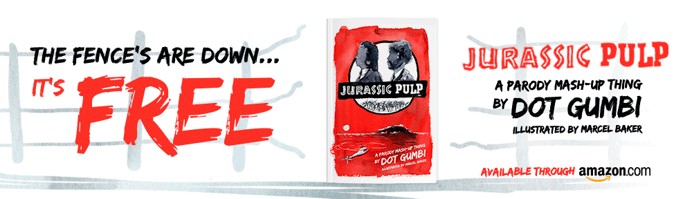
I quite enjoy doing these as a bit of filler fun in and around other design jobs. If I cook up anymore I’ll post them. Or if anybody has any requests, please shout me below.

These are really cool 🙂
Thanks! Hope to do some more before the year is out. Got an idea for ‘silence of the lambs’…just need to make it work.